
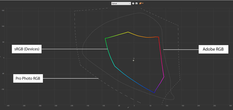
What is RGB colour space? RGB simply stands for Red, Green and Blue. It is the combination of these three basic colours that makes up the entire spectrum of secondary colours. The RGB colour space contains different libraries of which to choose from.
sRGB is the most common RGB work space because it is the easiest to manage, making it the ideal colour space for the web. Most monitors cannot display any colours beyond that of the sRGB colour space.
Adobe RGB 1998 is a wider gamut work space than sRGB. Adobe 98 has become a default photographic RGB space in recent years.
Pro Photo RGB (created by Kodak) contains all possible colours, even if they cannot be viewed on screen or in print. With the advancements made with digital photography and the RAW workflow, Pro Photo RGB has become a popular working space for those wanting to extract every drop of colour out of the process.
~MARC CHAGALL
Proper colour management is highly important. Here at Cottontail Press, our studio is fully colour managed every step of the way — starting from our fine art digitisation services through to the finished fine art print. This allows for precise and predictable colour output first time, every time.
Another factor is your paper choice. Our ICC profiles are created by us, specifically for the fine art papers we print on. We have several different papers to choose from, some with a wide gamut range and some with a lower gamut range. In general, matte papers have a smaller colour gamut than semi-gloss or gloss papers. We suggest that you consult with our team if you are unsure about which paper will best suit your image. We also provide sample packs for those who would like to see and feel the different types of paper we offer and to observe the colour reproduction on the different media types.
Learn a little more about colour management and paper in this article.
We will be posting more about gamut, tonal range and colour management in the future but for the time time being, please feel free to contact us directly with any questions you may have.